Residential
2022
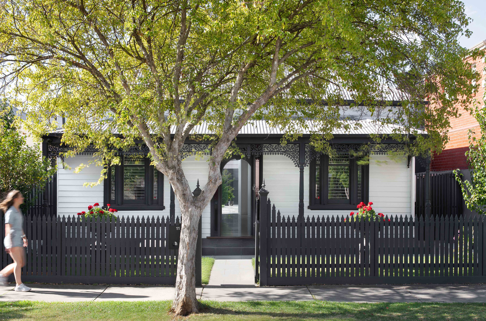
In 2018, our clients – a professional couple with a pre-teen daughter and a feisty boston terrier named Archie – purchased a quaint, double-fronted Victorian-era worker’s cottage in the Melbourne suburb of Malvern. Despite being endowed with bountiful heritage charm, the home had poor solar orientation and – with only one bathroom, located at the opposite end of the house to the bedrooms – was inauspiciously laid out for contemporary family living.
They came to us with a typical Alts & Ads brief: to update and extend their period-style home, opening it up to the more auspicious northern aspect to the rear of the property, and rendering it better suited for modern family life. With aspirations to retain the heritage charm of the original volume, their brief stipulated that any alterations and additions should be modestly refined, and not exceed a single-level layout, so as to minimise the impact on the amenity of their neighbours.
“Being restricted to a single-level layout encouraged us to be more sculptural with the architectural form,” says Kate Hatherley, Associate Architect at Cera Stribley, who designed the house.
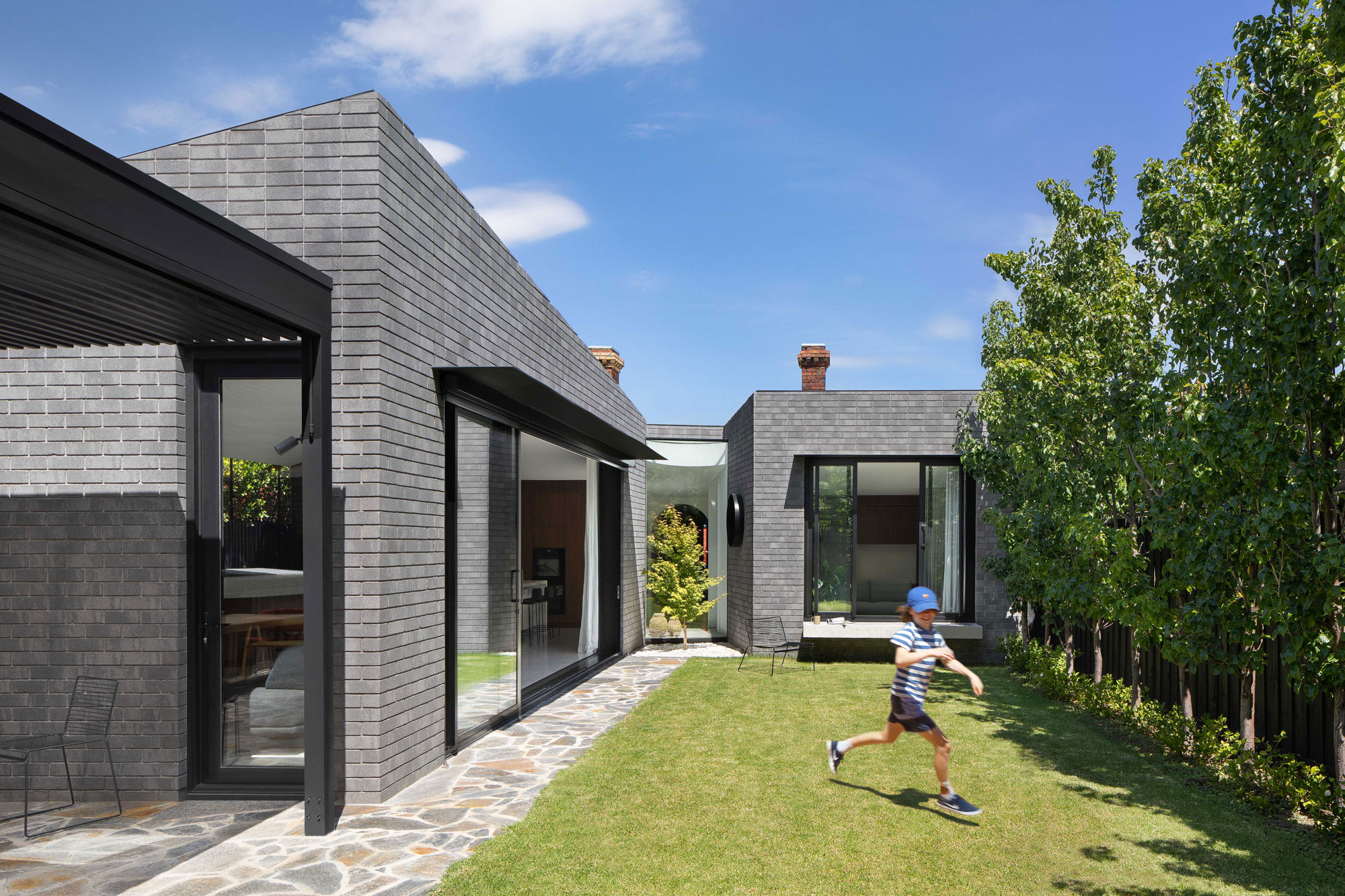
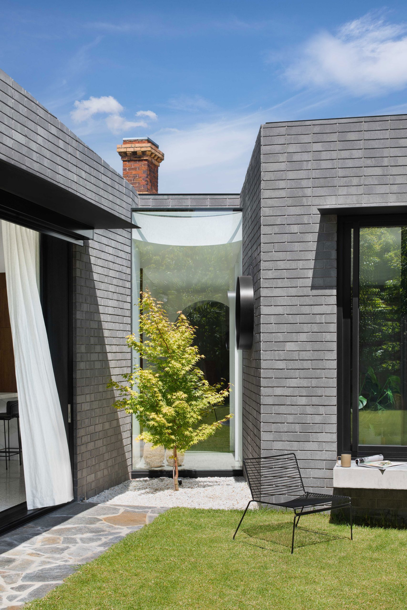
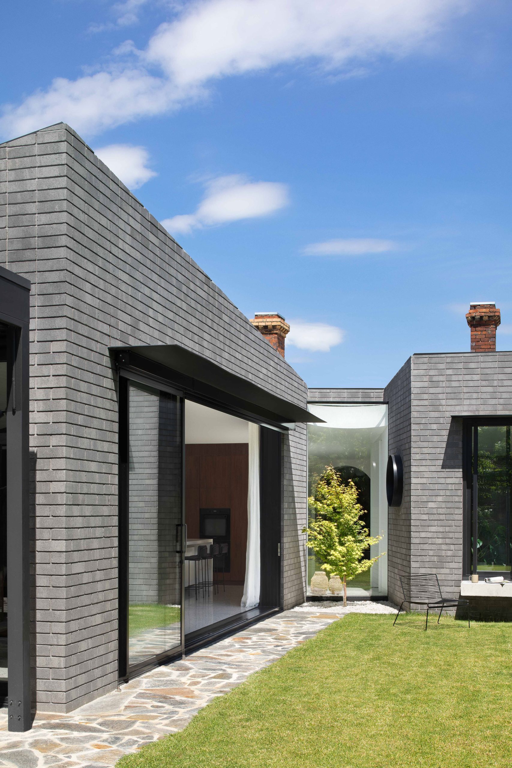
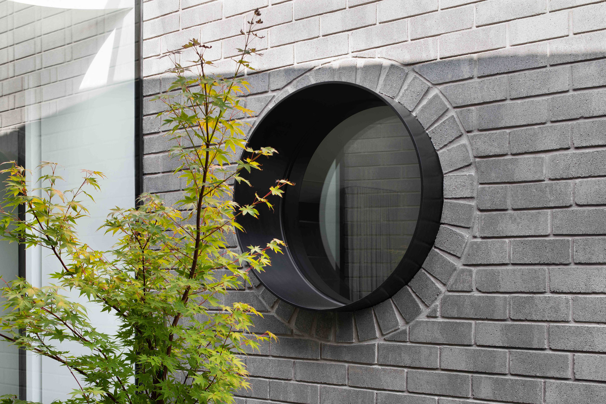
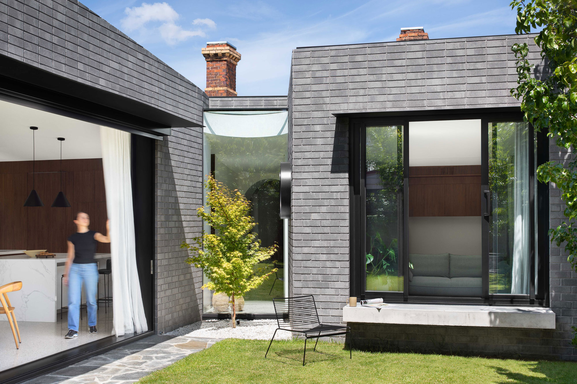
The main architectural design concept is driven from a desire to create a sophisticated modern form while using restrained articulation and material associations to merge into the neighbourhood character of the immediate area. Light grey brickwork and a contemporary reinterpretation of the classical pitch-roof form denote a level of modern refinement while allowing the extension to find itself at home within the neighbourhood.
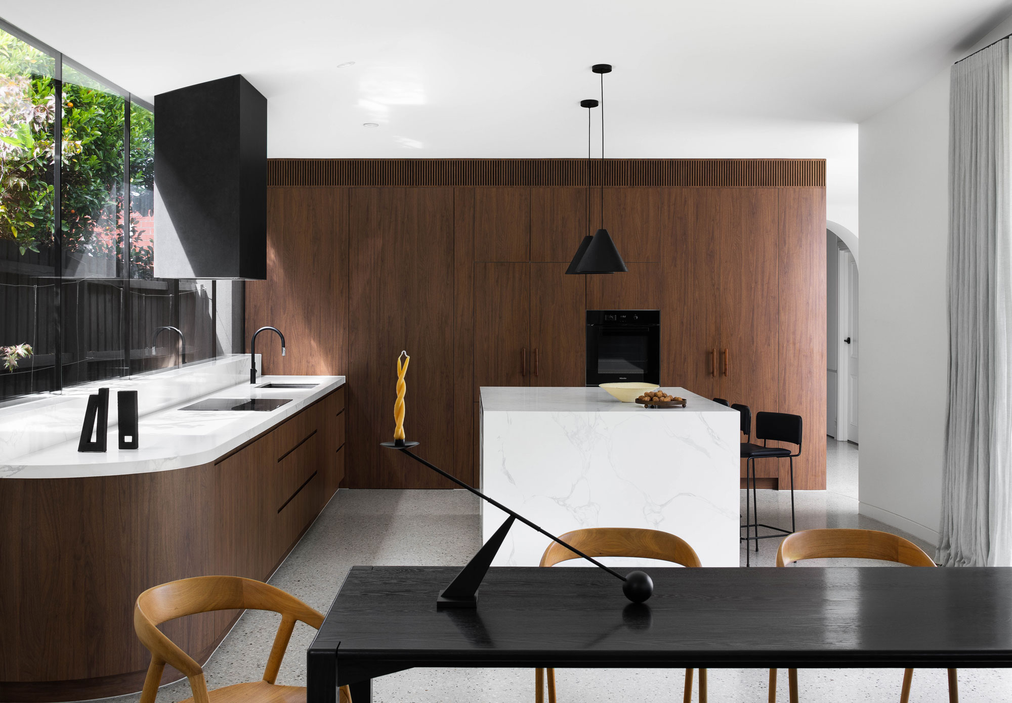
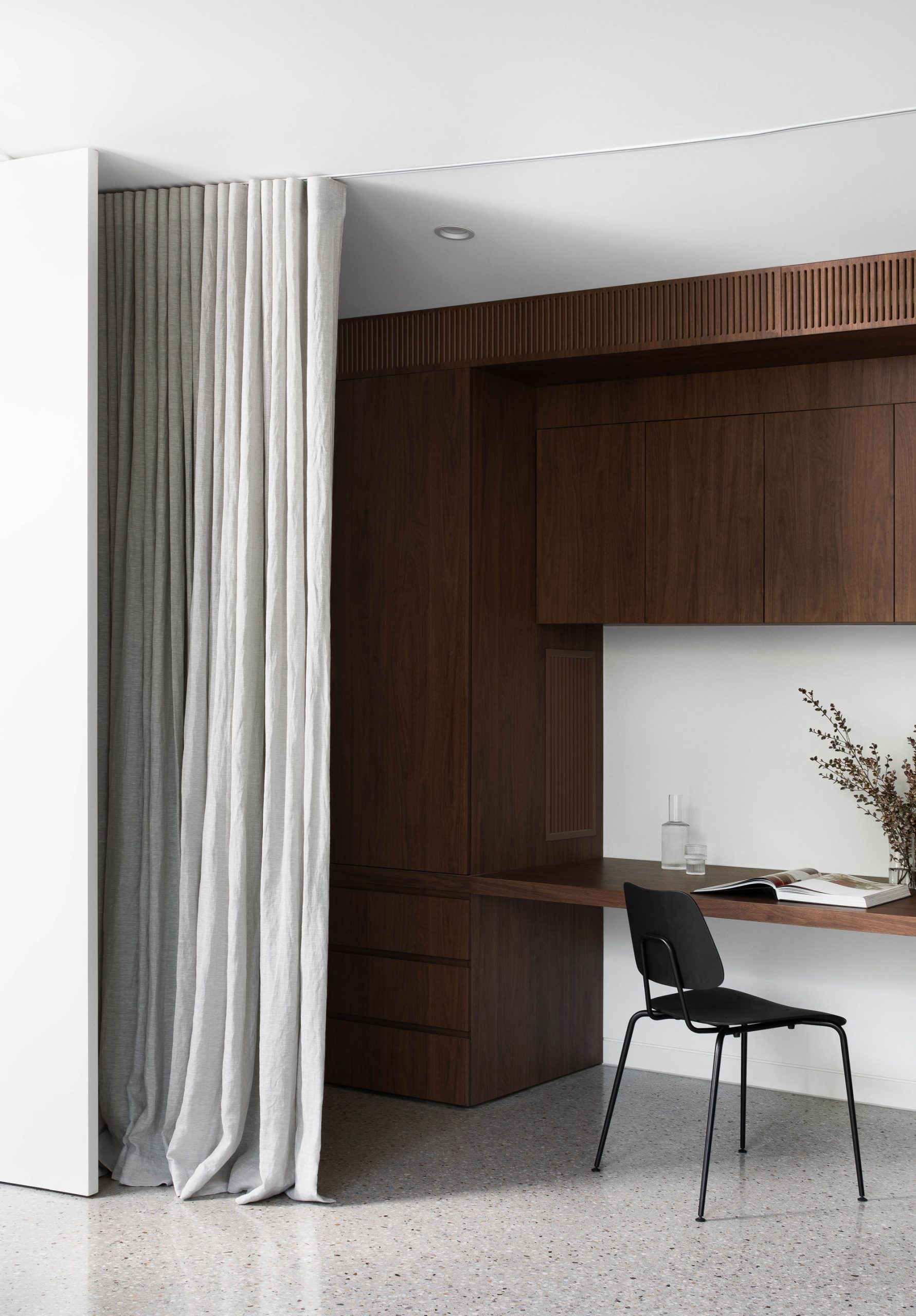
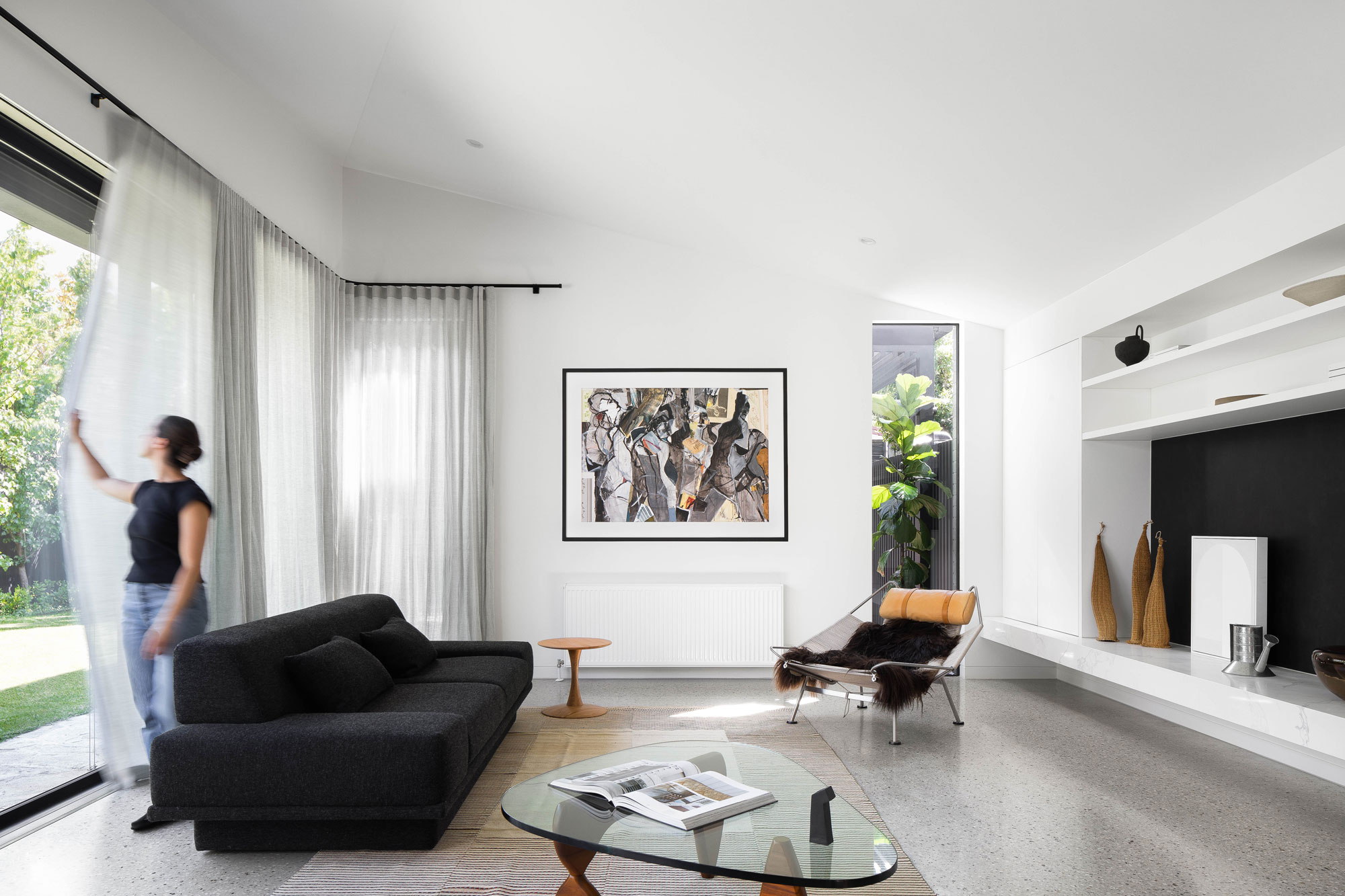
“This extension was all about opening the house up to the northern aspect, to the rear of the site,” says Kate. The volume of the extension diverges into two asymmetrical wings at the rear of the property, framing a quaint courtyard and outdoor entertaining area. Traversing the length of the site’s eastern boundary and spilling out into the courtyard in the north-west, the larger of the two new wings houses the primary kitchen, dining, and living space. Meanwhile, the smaller wing creates space for a rumpus/study, accommodating our clients’ need to occasionally work-from-home.
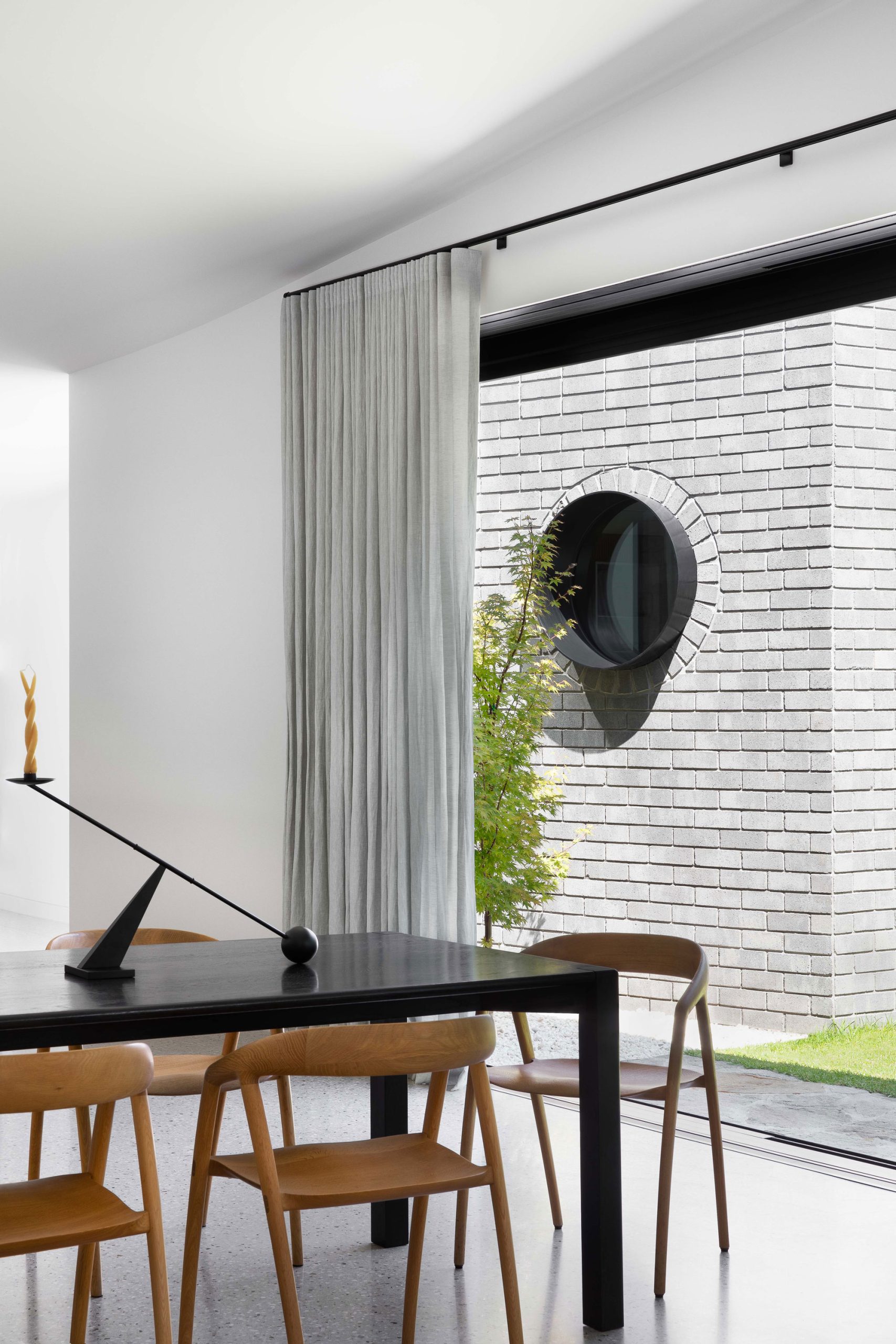
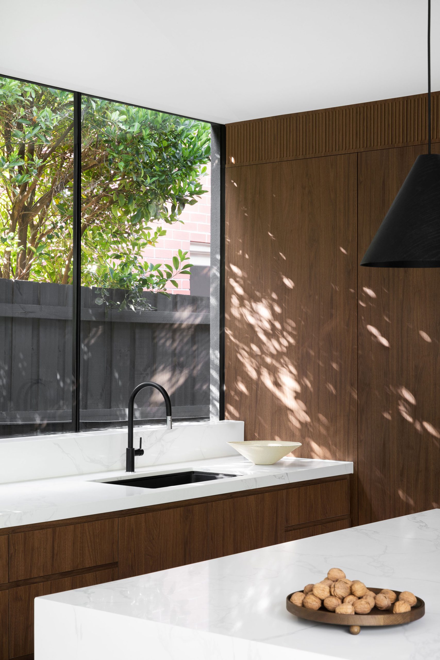
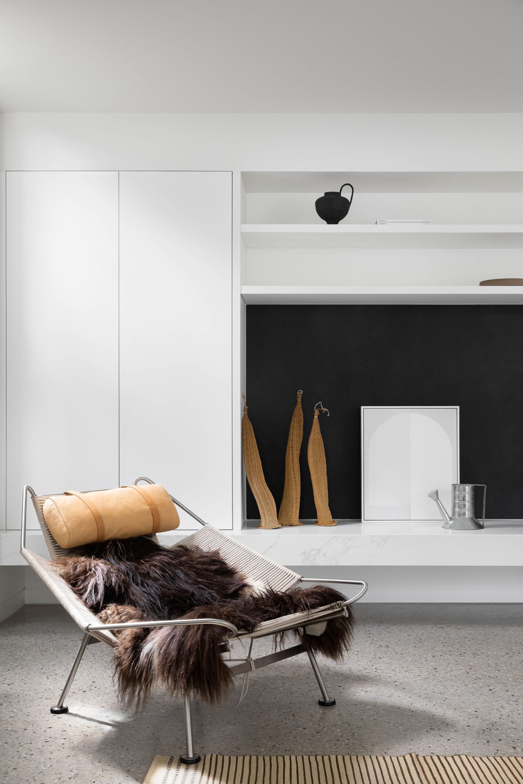
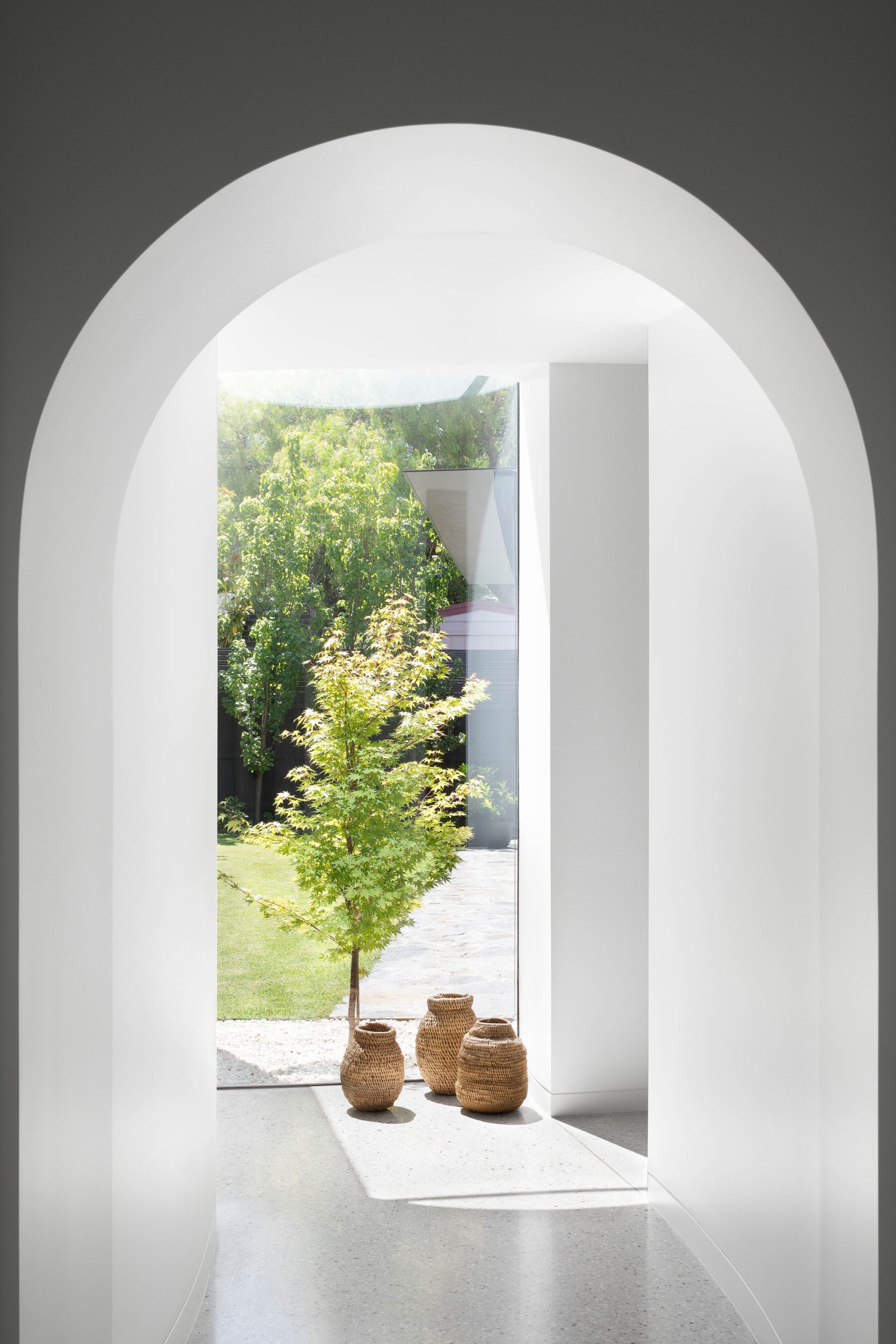
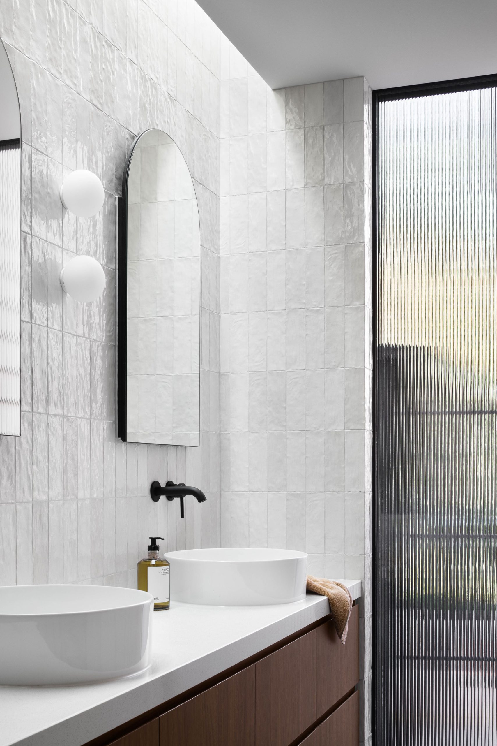
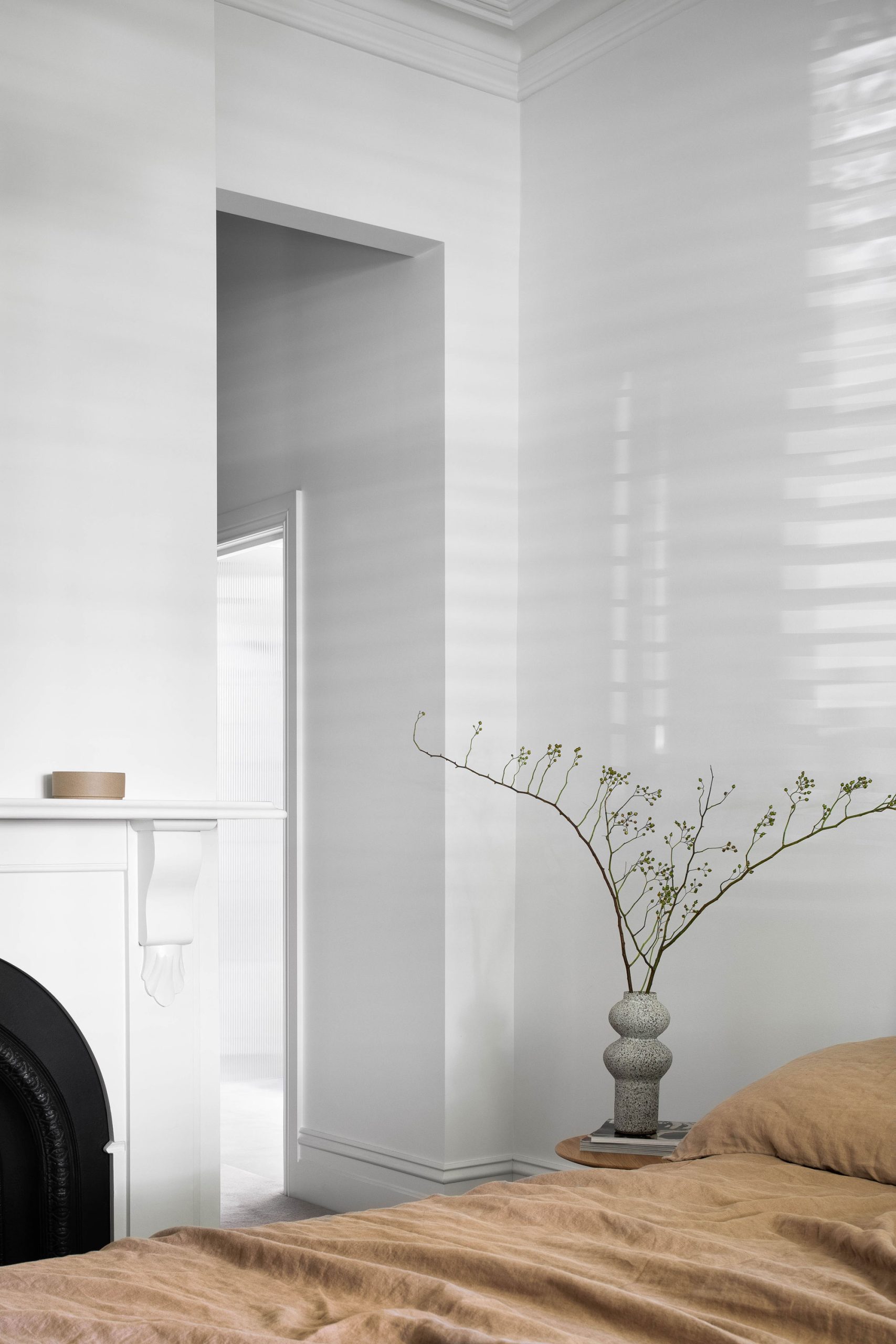
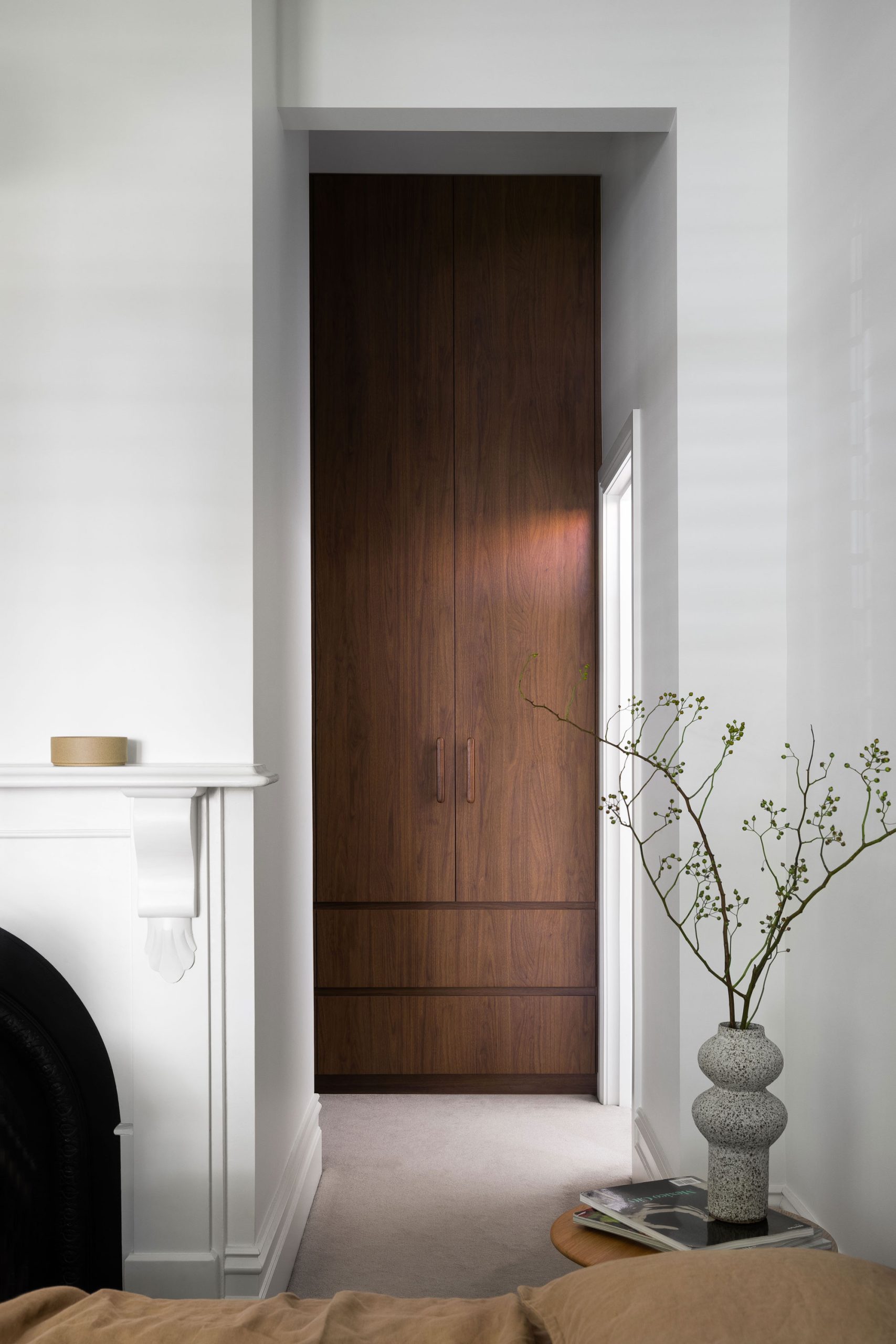
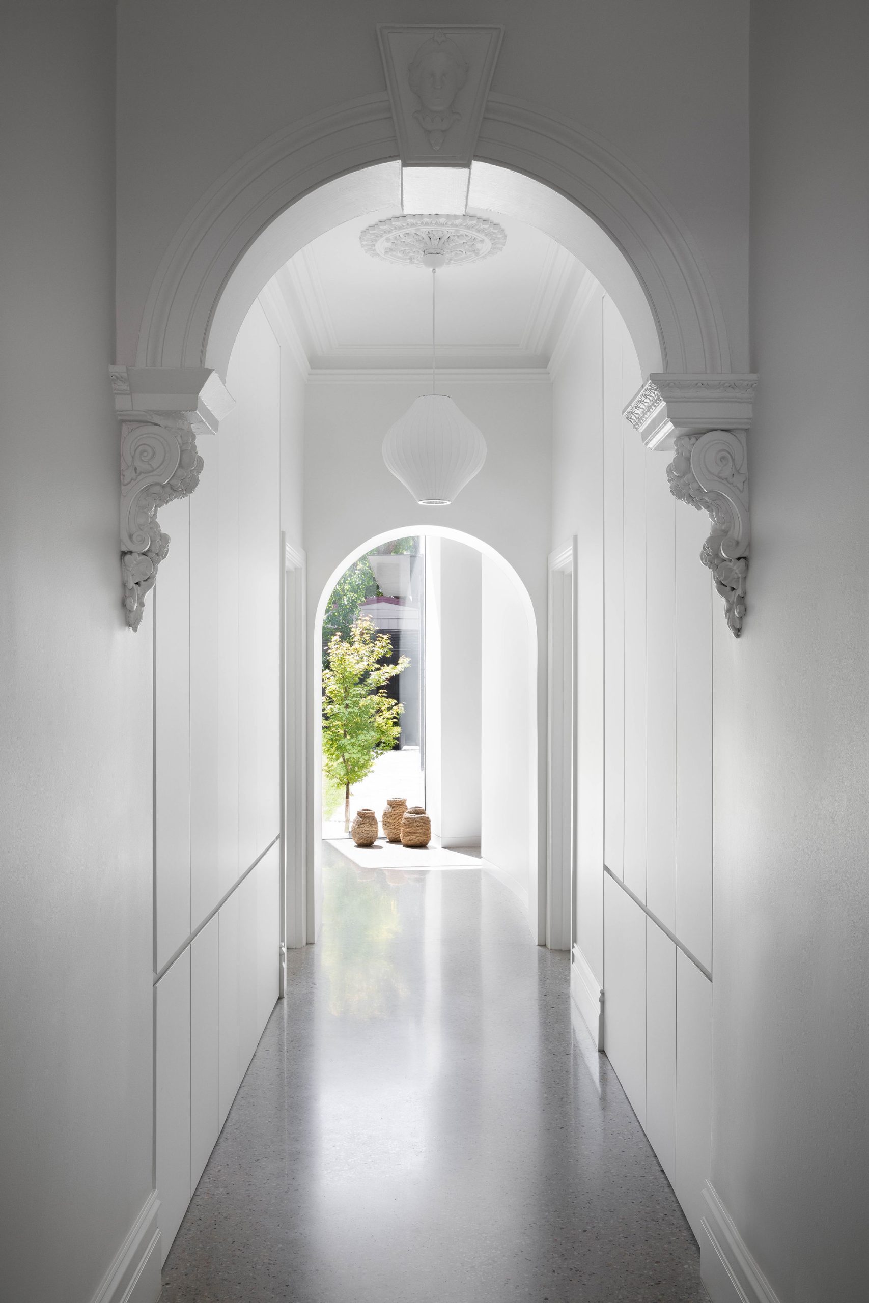
Unpretentious and pared-back, the interior design channels the spirit of Danish minimalism, while celebrating heritage features of the original volume. Walnut joinery breathes depth and warmth into the otherwise crisp, clean aesthetic, while exposed aggregate polished concrete flooring lays the foundation for an enduring family home.
Photography by Emily Bartlett
Styling by Jess Kneebone
Build by The Melbourne Builder
