Commercial
2025

The architecture aimed to embody the personality and aspirations of the client’s wider team, who they are and what they are all about.
The rhythm of the façade has been created by the displacement of vertical thin mullions that creates a patterned rectangular grid. Combined with a graduated fading film on the glazing, the lightness and transparency of the façade is emphasized, whilst providing some privacy to the occupants. This language is then contrasted by the robust concrete entry which anchors the building and establishes a sense of arrival.
Reflecting the client’s business and the teams’ personality was paramount from the start of this project, especially in the interior spaces. Consulting and adjusting throughout the process of the build alongside the Texco team, the Interiors are a direct reflection on how they use their office, both the working and collaborative spaces and the social and break out spaces.
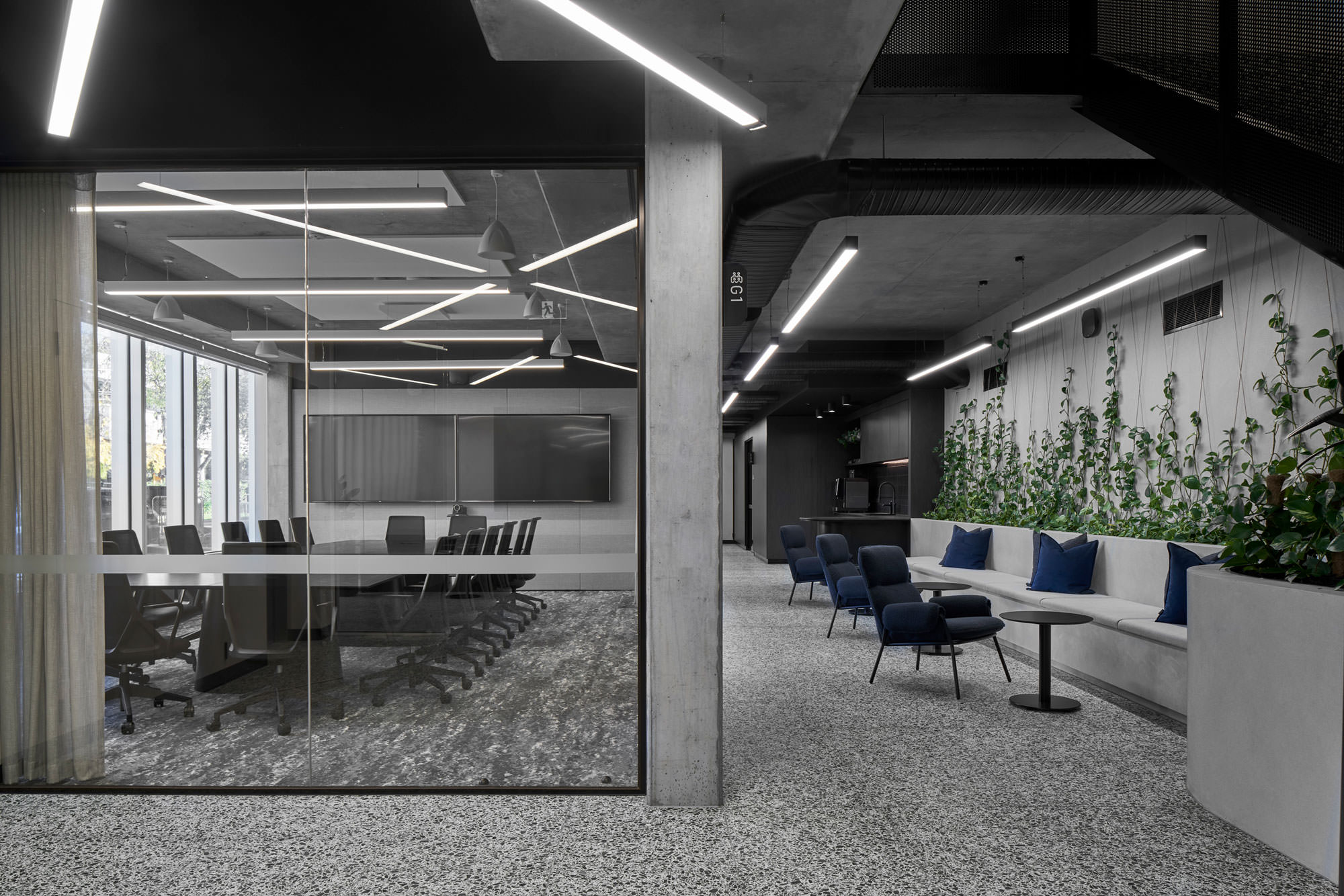
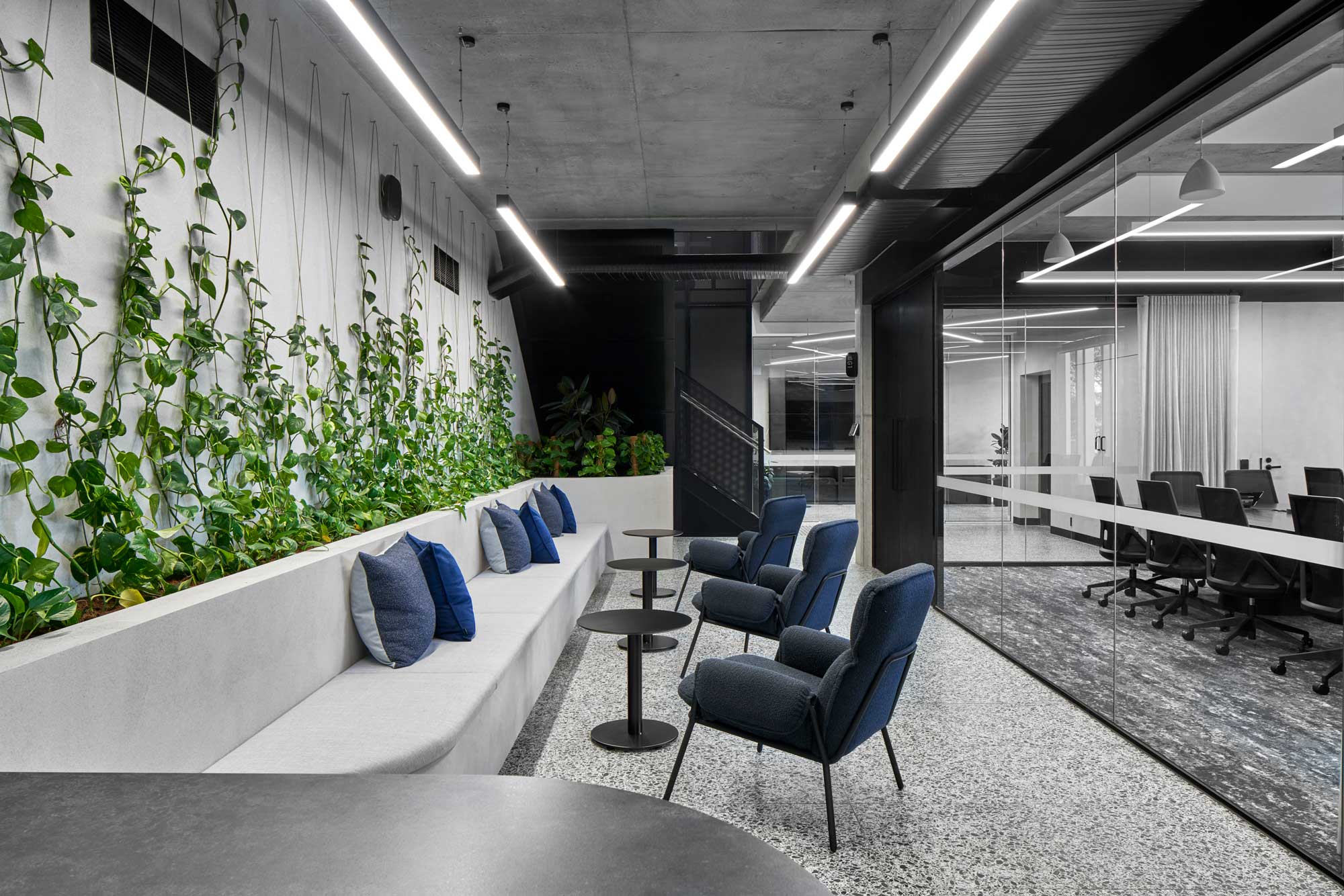
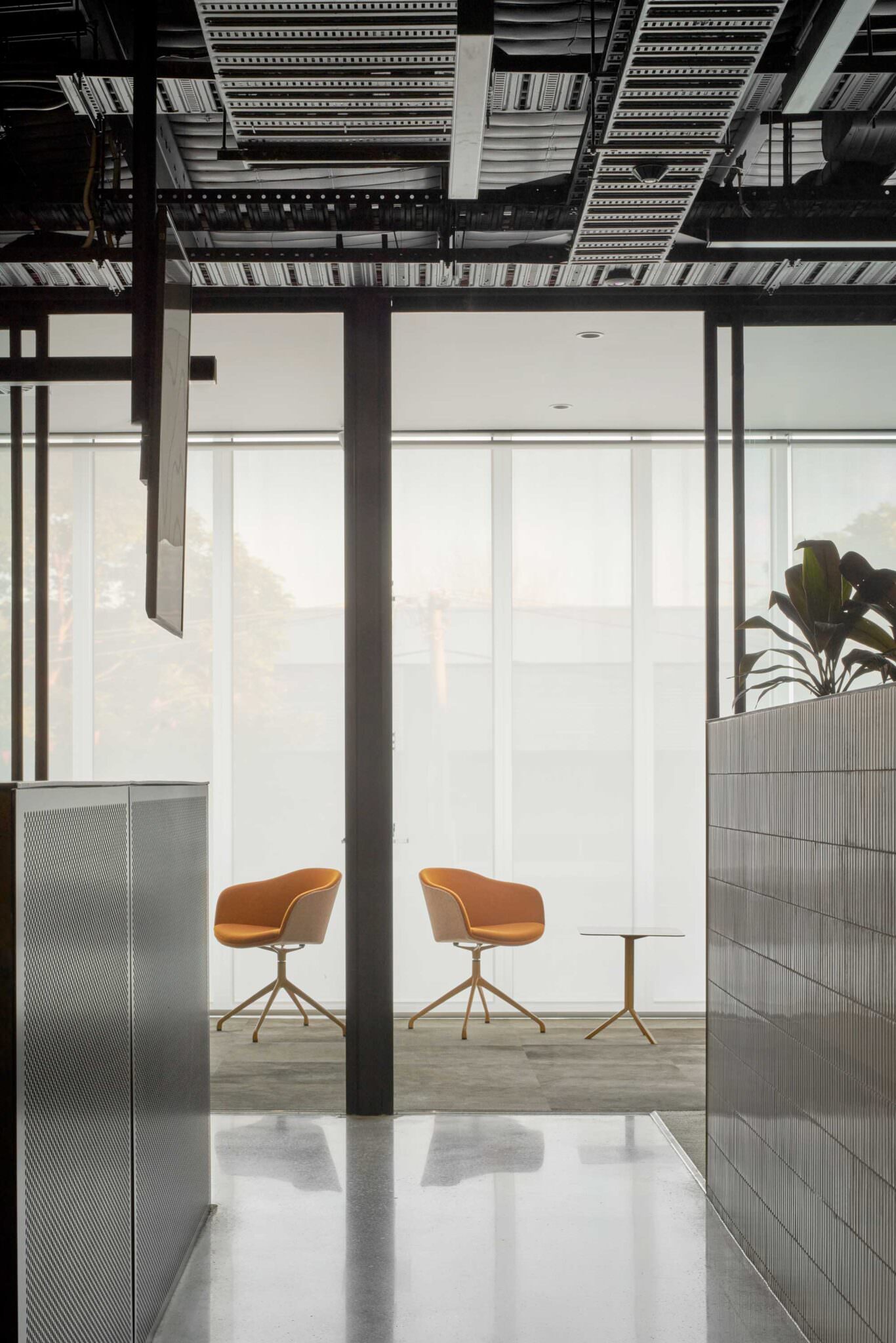
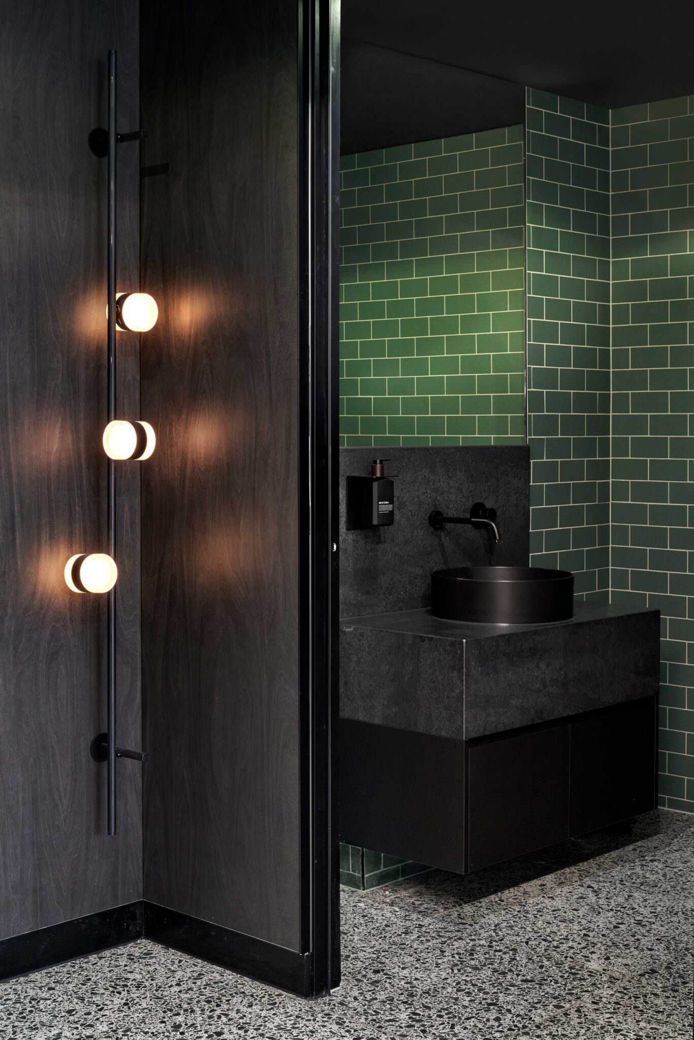
A monochromatic scheme was curated for the ground floor, which encompasses spaces of the entry lobby, four boardrooms, informal client meeting tables, kitchen-bar and client / front of house amenities.
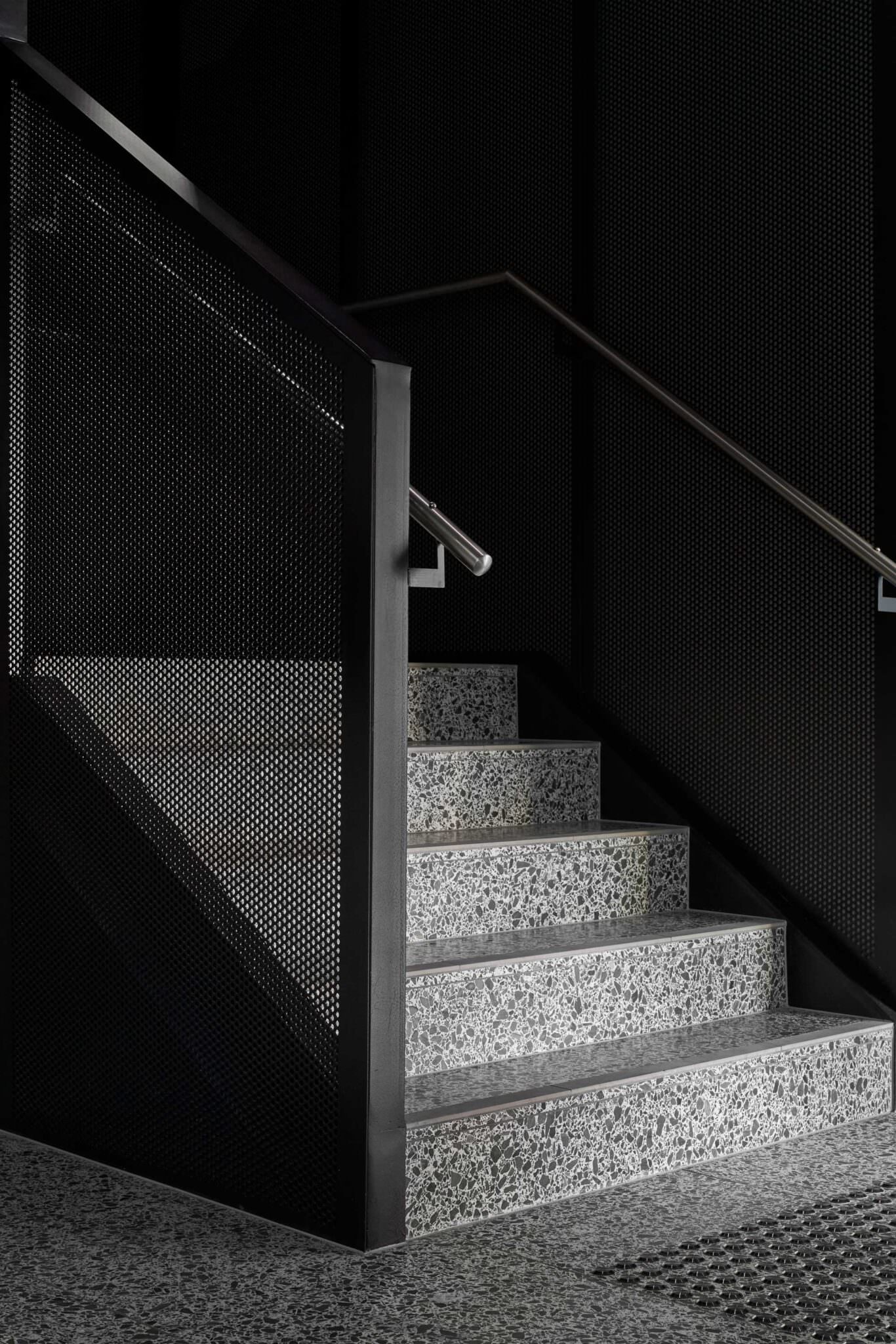
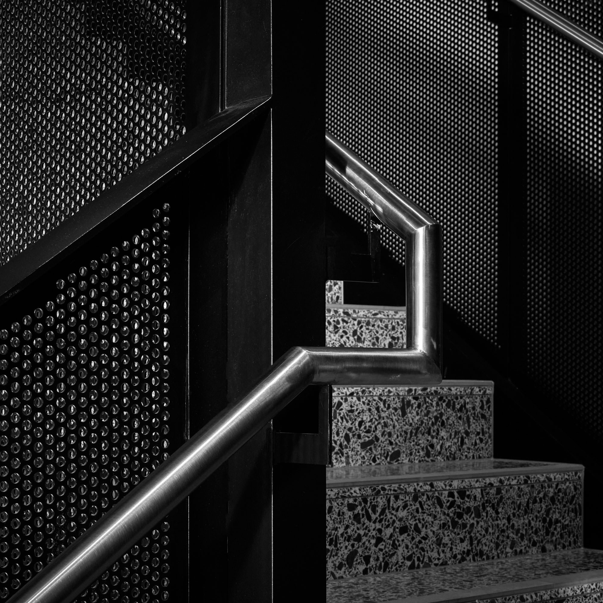
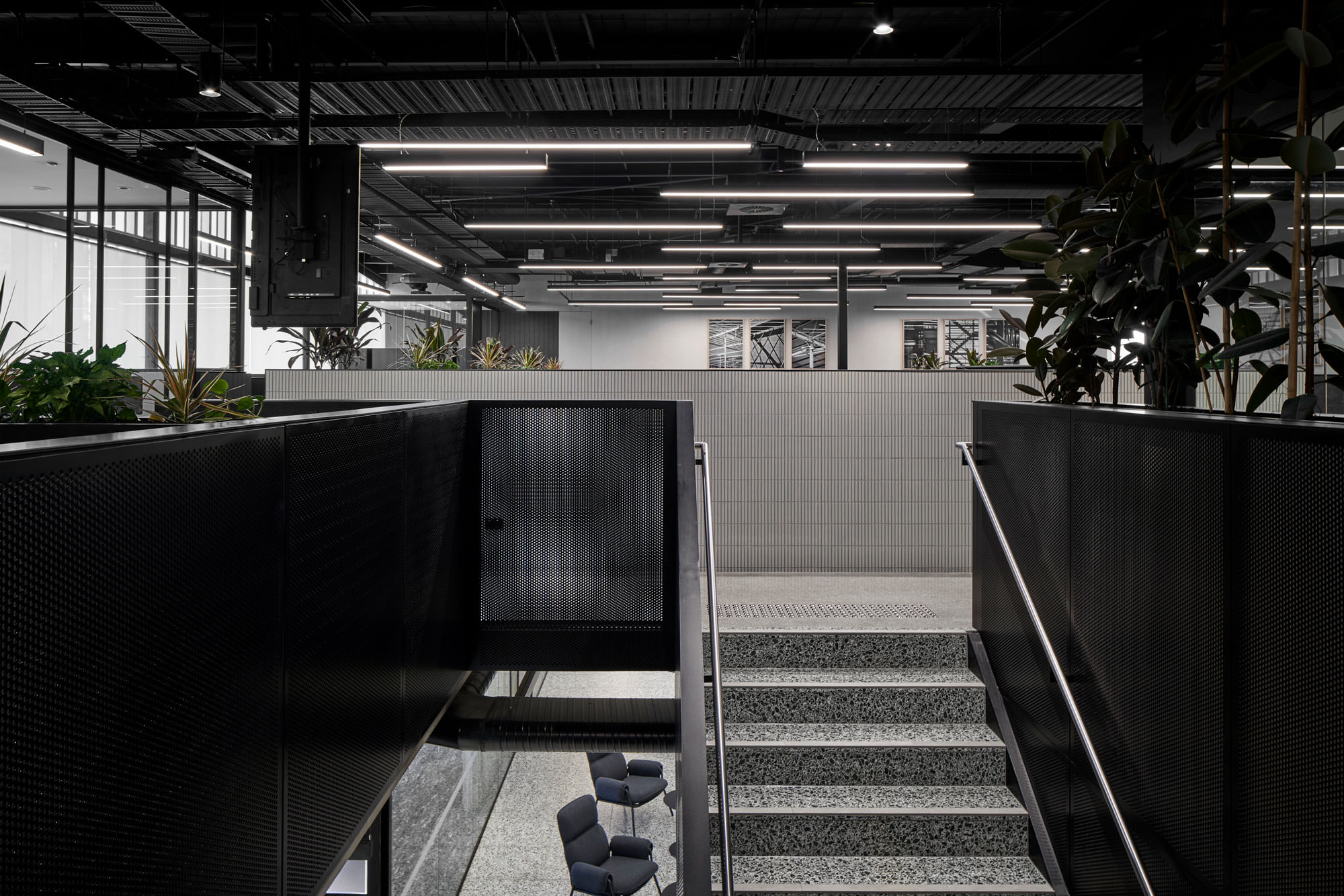
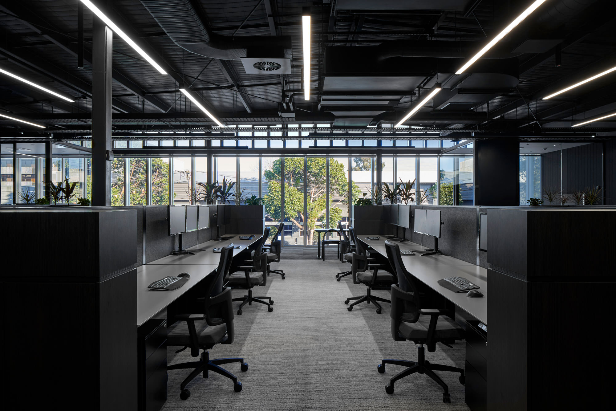
Touches of colour are added with the use of the tinted terrazzo floors, green planting wall beyond which an industrial stair leads to the upper floor. The first floor comprises the more informal staff working hub and associated amenities. Drawing on the concept of small industrial land subdivisions, the first-floor spaces incorporate this theme through the spatial layout and colour variations. The first floor includes an expansive exposed roof to the open plan office area, large communal team kitchen and amenities.
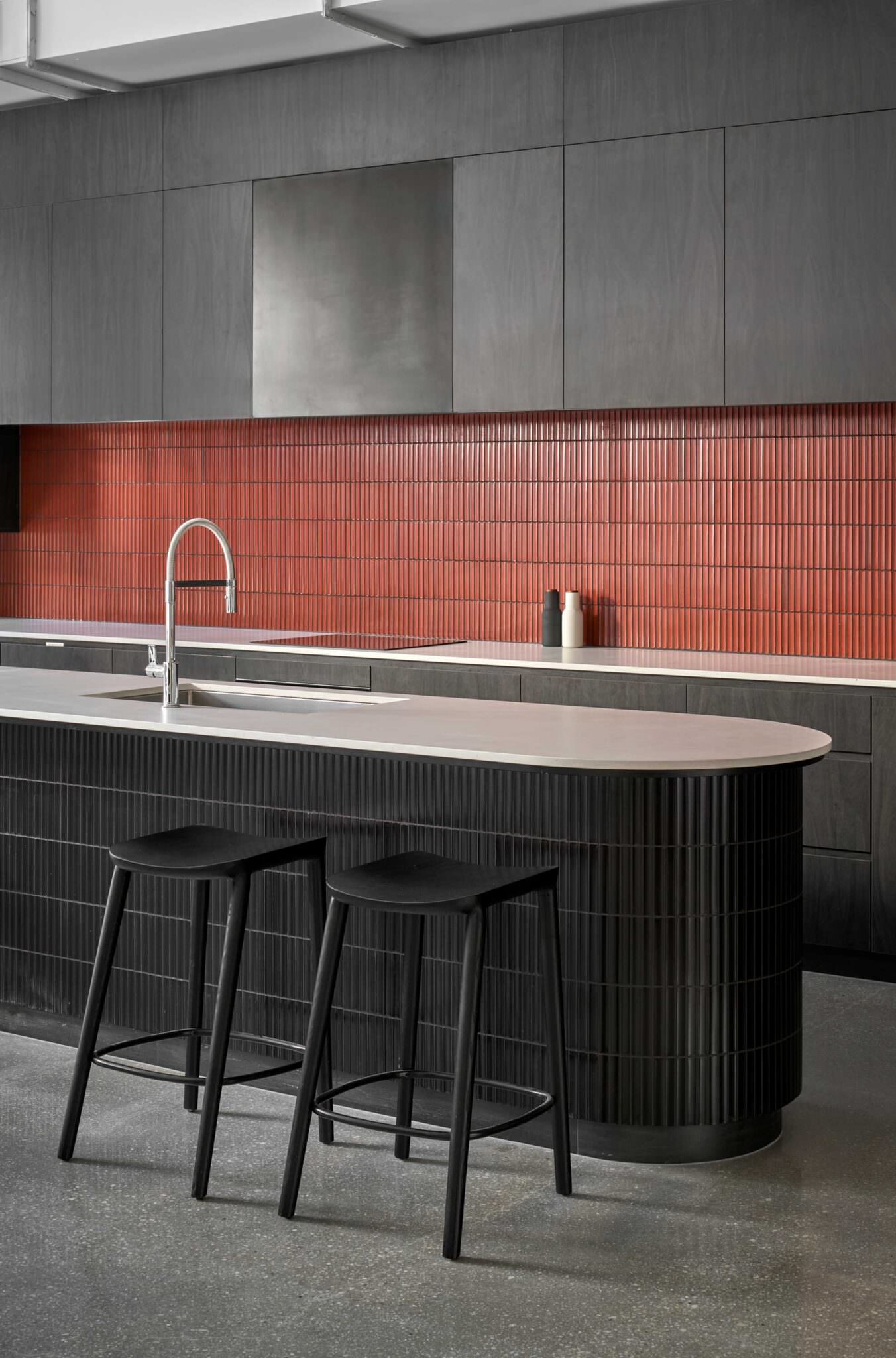
Built around a 5.5-metre island bench large enough to accommodate team gatherings the open plan kitchen is a highlight of the client’s new office. From a practical perspective it allows staff to move freely as they prepare healthy meals, take a break from their desks and socialise.
The client’s design input meant they could customise many aspects, specifying two of everything to avoid overcrowding at the lunch hour rush. Since moving in, this kitchen has become a central ‘watering hole’ of sorts and at the end of every week it’s the go-to spot for everyone to come together for their regular Friday wrap-up.
Project featured on indesignlive.com
